
How Posters “Work”
I once had a friend ask me, “What exactly is graphic design?” The answer seemed pretty easy, as the name appears self-explanatory: design using graphics. But, truthfully, it was harder for me to get into the details of what exactly it is, even though it has been one of the most prolific and widely-used art forms in the modern era. And not unlike some other forms of modern art, there is the hackneyed response, “I could totally do that” while viewing graphic design that has been elevated to a higher status. In fact, I even heard it at the Cooper Hewitt’s long-running installation How Posters Work.
Amazing to hear that response, given the museum’s breadth of information presented about not only about the history of the medium but also contemporary approaches to it. Furthermore, the beginning of the exhibit, before really immersing the viewer in the posters themselves, contains a section attempting to relay just how graphic designers see, and how it subsequently affects how we decipher messages from images, be they subversive or overt. For example, how designers use black space, how they visualize colors to lay over each other and blend, and the ways in which they see text aligned on a poster to result in certain reading patterns. That was particularly interesting as areas of posters are darkened except one swirl-type shape, and it notes that eyes begin at the thicker portion of the illuminated swirl, and move down to the thinner part across the page. Images are placed alongside text strategically to guide the viewer’s eye. If this sounds like manipulation, it’s because it is, and the exhibit doesn’t attempt to hide it.
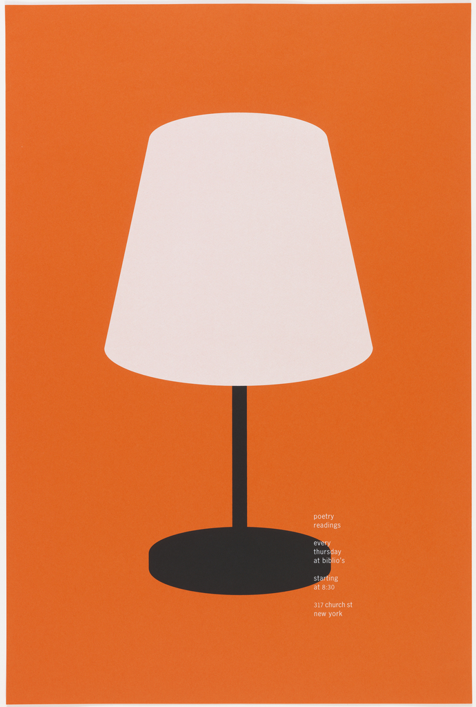
Most of the works are deeply rooted in the art of the advertisement, as posters were a major tool for mass information. Some of Cooper Hewitt’s posters (and all are from their permanent collection) take a step away from the traditional ad’s goal of capturing the essence of the subject in order to proliferate a message. Alexander Gelman’s Poetry Readings (1996) uses, as the wall text notes, an “off kilter” symbol of a sole lamp and minimalist text against a bright orange background to promote poetry readings at Biblio’s. Then there is the dramatic application of the mundane in Food is a Weapon (1943), published by the Office of War Information. It almost violently encourages people not to waste food, just like you wouldn’t waste a weapon. The implications are strongand the design fitting. And, both pieces highlight the firm connection graphic design has with the everyday, more so than other art forms.
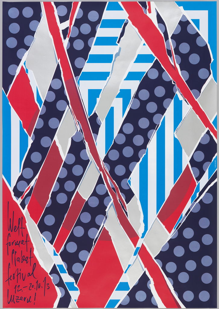
What I found especially appealing is the connection graphic design has with collage in the relationship to the everyday and in technique. The museum dedicates a section of the exhibit to poster artists employing the practice of layering, just as collage artists do. A significant piece in the world of contemporary graphic design, René Put’s Poster No. 524: Focal Point (2012) is one of the first pieces on display, directly next to the vitrine’s glimpse into the different ways a graphic designer visualizes objects. Put, along with Rianne Petter, collected 523 posters from the street, decided what the focal point was for each, and cut it out in the shape of a circle. They then layered the circles on top of and against each other to create a new poster from the segments. It’s a testament to the creative process and allowing individual parts to speak both for themselves and for the whole – a crucial part of both collage and graphic design. Other works up also show the painterly aspect of creating digital layers, such as Weltformat (2013) for a festival.
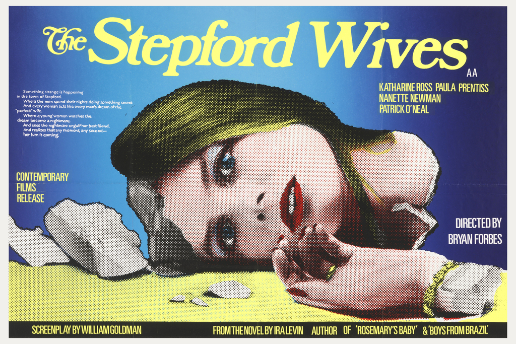
And finally, nearing the end of the show, there are radical political advertisements – some promoting funding for AIDS research, others denouncing the need for war – on a wall across from movie posters under the subsections of “doubling the meaning” and “telling a story” respectively. Yet both highlight the use of the uncanny to tell a story in essentially one frame. A movie poster for The Stepford Wives (1975) is one of the larger works. Though most of us are familiar with the story (and it’s pretty terrible remake) closer examination of the specific approach to this poster reveals all that is at work underneath the images we see on a daily basis and file away in long term memory. A wife’s face is central, yet the broken fragment from her head reveals the mannequin-aspect, as does the broken off hand laying at the foreground. Yet the face itself is utterly human, thereby posing the question to the viewer of what strangeness lies beneath, and where will this story take us? Again, the parts make up the whole yet their separate components are like the words making up a sentence – alone each has its own meaning.
The point of posters is to allow for pleasurable ingestion of images with the meaning right there for the taking – therefore, they are one of the most accessible works of art. What Cooper Hewitt successfully does, however, is highlight the level of mastery of the craft by these artists. In this light, the name of the exhibit is not so much about how posters work, but how their creators do. And furthermore, the show elevates the amount of craft and drafting required to create one truly successful popular image. To bring up another hackneyed expression, “they make it look easy.”